Getting started
Admin panel view
After login into the admin panel on the left side we can see menu panel:
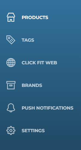
On the right upper corner you can see the button ‘Sign out’ which allows users to logout from the admin panel and go back to the login page.

Menu
Products
After choosing the ‘Products’ menu on the left side of the screen the user will see search fields and the products which were added to the app.
To search the model in the list of the existing products the user should enter the information like: name and status.

In the name field write the name of the product which you are looking for. In the status list you have the possibility to choose specific status of the product (published/not published) or all possible statuses.
After you are done with the search option press ‘Search’ button or ENTER.
If you want to clean all fields press ‘Clear’. After you press the ‘Search’ button, the list of all possible models which were added to the panel will appear on the screen.
The table contains:
- Model thumbnail;
- Name;
- Amount of published versions of the model;
- Actions button;
Add new model
To add a new model to the panel click the ‘Add’ button on the top right corner. An additional form will appear on the screen where you will be able to add information about the model and its variations.
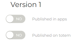
First option in the form is a toggle button which allows you to publish the model in the app.

Buttons publishing versions of a given model in particular applications (e.g. totem, mobile application) are located next to version details.
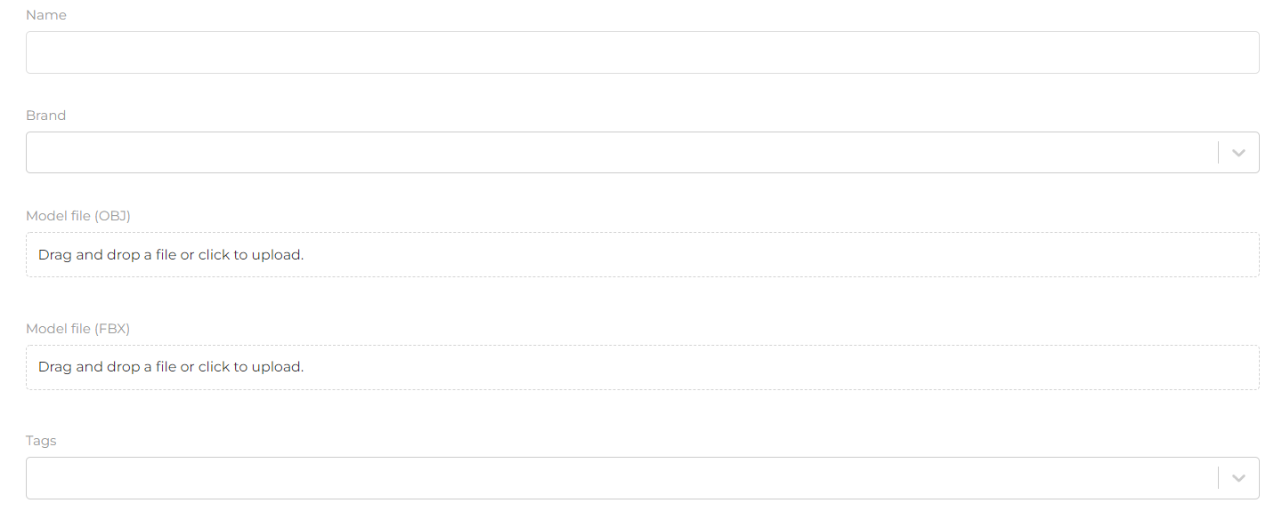
The ‘Name’ field allows you to add a model name.
The ‘Brand’ field allows you to add a brand (if you have more than one) to the selected model. This field is completed by selecting from the drop-down list of brands on it.
The ‘Tags’ field allows you to add a tag (keywords that allow grouping products with similar characteristics) to the selected model. This field is completed by selecting from the drop-down list of keywords on it.
Note that there are two “Model file” fields that are used for adding model’s files (*.obj or *.fbx).
Next you will find the model settings in iOS, Android and in the browser (the model settings in the browser are only available if the virtual fitting option is enabled in the browser).
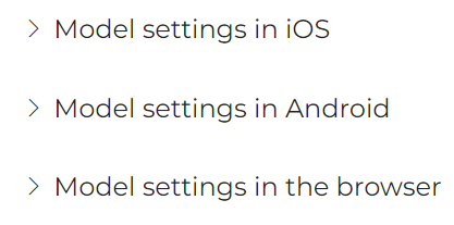
Model Settings
- Model Settings in iOS
To see the model settings options click on the arrowhead, when clicked the settings options will expand in the form of four sliders. These settings are used to adjust the size and position of the model in the app. Operation of each slider:
-
iOS scale - used to shrink (move the slider to the left) or increase (move the slider to the right) the model. The scale takes values from 0.5 to 2.
-
iOS up/down position - for changing the position of the model - up (move the slider to the right) or down (move the slider to the left). The scale takes values from -1 to 1.
-
iOS front/back position - used for changing the position of the model - forward (move the slider to the left) or backward (move the slider to the right). The scale takes values from -1 to 1.
-
iOS rotation - used to change the tilt of the model - tilt up (move the slider to the left) or tilt down (move the slider to the right). Scale taking values from -10 to 10.

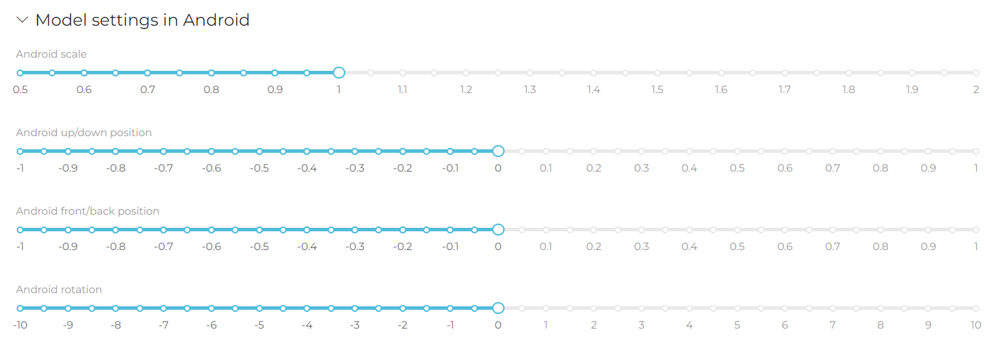
- Model settings in Android
To see the model settings options click on the arrowhead, when clicked it will expand the settings options in the form of four sliders. These settings are used to adjust the size and position of the model in the application. Operation of individual sliders:
-
Android scale - used to decrease (move the slider to the left) or increase (move the slider to the right) the model. The scale takes values from 0.5 to 2.
-
Android front/back position - used to change the position of the model - upwards (move the slider to the right) or downwards (move the slider to the left). The scale takes values from -1 to 1.
-
Android front/back position - used to change the position of the model - forward (move the slider to the right) or backward (move the slider to the left). The scale takes values from -1 to 1.
-
Android rotation - used to change the inclination of the model - upward tilt (move the slider to the left) or downward tilt (move the slider to the right). The scale takes values from -10 to 10.
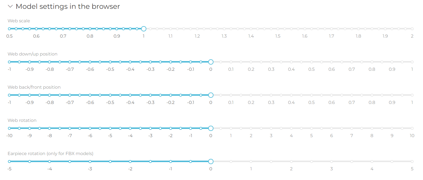
- Model settings in the browser (model settings in the browser are available only when the User has the virtual fitting room option enabled in the browser). These settings are used to adjust the size and position of the model in the browser. Operation of individual sliders:
-
Web scale - used to decrease (move the slider to the left) or increase (move the slider to the right) the model. The scale takes values from 0.5 to 2.
-
Web down/up position - used for changing the position of the model - upwards (move the slider to the right) or downwards (move the slider to the left). The scale takes values from -1 to 1.
-
Web back/front position - used to change the position of the model - forward (move the slider to the right) or backward (move the slider to the left). The scale takes values from -1 to 1.
-
Web rotation - used to change the inclination of the model - upward slope (move the slider to the left) or downward slope (move the slider to the right). The scale takes values from -10 to 10.
-
Earpiece rotation (only for the model, whose file has FBX extension) - used for changing - increase or decrease - the tilt of temples (applies to glasses models).
Variants of a particular model
The next part of the form contains information on variants of a particular model.
Next to each version there is a button described above which enables to publish the variant of the model in the application and on the totem.
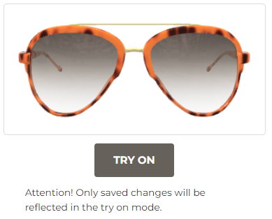
‘Try on’ option is a button below the thumbnail which allows you to try on the model variant via the browser (only visible when the user has the online try on option enabled).
Tags
The ‘Tags’ menu is used for creating and managing keywords that will be assigned to the products to group them and for easier search.
By clicking the ‘Add’ button the user is able to add a group of tags. After clicking the button a pop-up window will appear on the screen which will allow the user to add a new group of tags (hashtags).
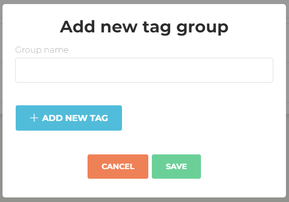
In the ‘Group name’ field enter the name of the tags group (it takes any string of characters).
To add a tag in the group press the ‘Add new tag’ button. In the same pop up window a new field will appear where you can add a name of a new tag. To delete just added tag press ‘X’ button. To save the new group of tags press ‘Save’ or press ‘Cancel’ if you want to abort adding the group.
Existing groups the user can edit or remove by clicking ‘X’ button. After clicking the ‘Pencil’ button editing options appear on the pop-up window.
Fields available for edition:
- Group name
- Tag name
Add new tag by clicking ‘Add new tag’ button or delete existing tags by ‘X’ button
To save the changes the user has to click the ‘Save’ button, to cancel - ‘Cancel’ button.
Click Fit WEB
In case of the implementation of the Click Fit Web solution, it is necessary to indicate in the system the pages on which it will be possible to view models.
After clicking ‘Add’ button you can choose product and its version and provide a link to the product details on your website. To save the changes the user has to click the ‘Save’ button

Push Notification
The “Push notification” section allows you to deliver short information to a device without a specific request from the client. To add new push notification click the “Add” button and fill the pop-up window with “Title” and the message of the push notification.
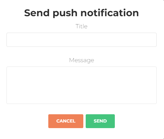
To save the changes and send the push notification the user has to click the ‘Send’ button. Push notification will appear on the Client’s device immediately. To cancel the changes the user has to click the ‘Cancel" button.
All push notifications will appear on the push notification list with date, title and it’s content.

Settings
In the field Language you can select language for the admin panel. To change the language select needed from the list.

The field Privacy Policy Link contains a link to the external page. You can edit/add your link to the Terms of Service & Privacy Policy page.
You can also use internal page and enter the content to the field Terms of Service & Privacy Policy. To save changes in settings please press ‘Save’ button.